HomeAll NewsEducationTV
Equities & FundsCrypto & Digital AssetsAI & TechnologyBusiness & CorporateUS Politics & PolicyGeopolitics & Global RiskMacro, Rates & FXCommodities & EnergyEuropean Politics & MarketsAsia-PacificReal Estate & Property
Story archiveAll categories
← All Stories

Coca-Cola's New Font Draws Parallels to Marlboro

Created at 24 Jul · 3:46 PM1 source↑ Market-relevant
IN SHORT

Coca-Cola has unveiled a new global brand identity with updated typography. Social media users have noted striking similarities between the new font and the iconic typeface used by the Marlboro cigarette brand, sparking widespread discussion and comparisons.

✉Newsletter

PiQ Daily

Pick your topics. Get only what matters, on your cadence.

Key Numbers

200+markets for Coca-Cola's updated look
90-secondlength of announcement video

Who's Involved

Arnab Roy
President of Coca-Cola Global Category
Allen Adamson
Cofounder of brand strategy firm Metaforce
Andreas Storm
Designer who noted typeface similarities
Rachel Reno
TikTok creator who popularized 'fridge cigarette' nickname
Craig Heyne
VP of performance marketing at Bloom Nutrition
Coca-Cola's New Font Draws Parallels to Marlboro

↳ Why This Matters

The incident underscores how brand perception can be significantly influenced by internet culture and memes, potentially leading to unintended associations for global brands. It also highlights the ongoing challenge for established companies to refresh their image while maintaining their core identity and avoiding negative connotations.

Key facts

  • Coca-Cola launched a new global brand identity with updated typography.
  • Users on social media platforms like X pointed out the resemblance between Coca-Cola's new font and Marlboro's typeface.
  • The 'fridge cigarette' nickname for Diet Coke, which gained popularity on TikTok, has been linked to the rebranding.
  • Coca-Cola stated the refresh is intended to create a more consistent and recognizable brand presence worldwide.
  • Brand strategists emphasize the need for iconic brands to adapt their visual identity to stay current.

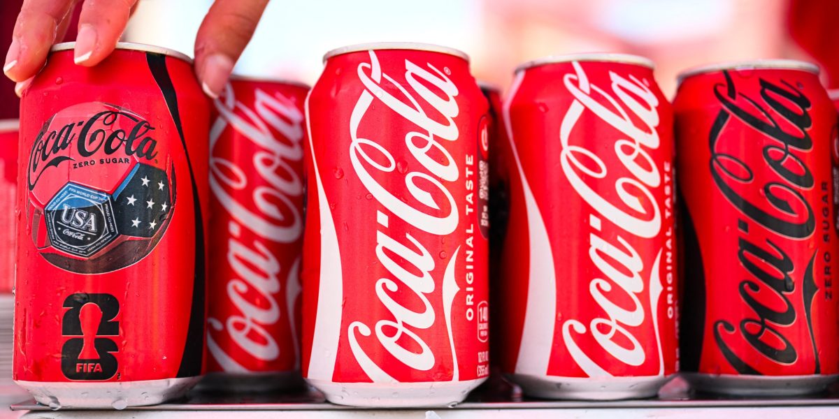
Coca-Cola has rolled out a new global brand identity, featuring updated typography that has drawn comparisons to the iconic font of the Marlboro cigarette brand. The subtle change, described by the company as a "visual refresh," aims to create a more consistent and recognizable look across its more than 200 markets.

Social media users quickly noted the resemblance, with many on platforms like X expressing surprise and drawing parallels to the "fridge cigarette" meme, a nickname that gained popularity on TikTok for Diet Coke. Some users interpreted the font choice as Coca-Cola leaning into this cultural trend, while others questioned if it was an intentional or unintentional association with a brand historically linked to public health concerns.

Coca-Cola stated that the refresh is designed to build on existing brand recognition and provide a stronger foundation for growth. Arnab Roy, president of Coca-Cola Global Category, emphasized the goal of being clearer and more consistent in the brand's presentation. Brand experts suggest that for globally recognized brands like Coca-Cola, continuous adaptation of visual identity is crucial for maintaining relevance.

Allen Adamson, cofounder of brand strategy firm Metaforce, noted that while consumers might focus on specific design elements like a font, a brand's identity is a broader system. He added that brands must constantly reassess their visual identity to ensure it communicates the desired image across all consumer touchpoints. The "fridge cigarette" phenomenon, which began in 2025, highlights how Gen Z reinterprets marketing messages through online culture and memes, influencing brand perception.

Frequently asked questions

The 'fridge cigarette' is a nickname that gained popularity on social media, particularly TikTok, for a cold Diet Coke, often consumed as an afternoon pick-me-up. It originated from a TikTok creator in 2025.

Coca-Cola stated the refresh aims to create a clearer and more consistent global brand presence, building on existing recognition to foster growth.

While many social media users noted a strong resemblance, designer Andreas Storm clarified that it is technically a different typeface, though the similarities are undeniable.

What Happens Next

01Coca-Cola will continue to implement its new global brand identity across all markets.
02Brand strategists will likely monitor consumer reactions and further brand adaptations.

Get the newsletter.

Pick the topics you actually care about. We'll email when there's news worth your time, on the cadence you choose. Cancel any time from your account.

Cadence

How It Developed

Coca-Cola introduced a new global brand identity with updated packaging and typography.
Social media users observed similarities between Coca-Cola's new font and Marlboro's typeface.
The comparison gained traction online, with some users linking it to the 'fridge cigarette' meme.
Coca-Cola stated the refresh aims for clearer and more consistent brand presentation globally.
Brand experts noted that iconic brands must continually evolve to remain relevant.
Sponsored

London Quick Take - 22 July - UK inflation softens, oil rises and chips rally ahead of Alphabet, Tesla earnings

SAXO

Sources

T1
Coca-Cola Reached for Nostalgia. Did It Get Marlboro Instead?The New York Times
T2
Why Coca-Cola's new logo has the internet calling Diet Coke a 'fridge cigarette' again | Fortunefortune.com
T2
Fans Are Trolling Coca-Cola's Rebrand For One Very Specific Reasondelish.com
T2
Coca-Cola's New Global Identity Is Dangerously Close to the Most Toxic Brand in the Worldgizmodo.com

Related Stories

Novo Nordisk seeks US court order to block Eli Lilly weight-loss ads
24 Jul · 8:44 AM
Syria bets on industrial comeback, reviving textile sector
24 Jul · 5:11 AM
US Entrepreneurship Surges to Record Highs, Fueled by AI and Pandemic Shifts
23 Jul · 5:06 PM
Volkswagen Cuts 2026 Sales Forecast After Q2 Profit Slump
24 Jul · 5:43 AM
Tencent fires WeChat manager over leaked 7-figure bonus
24 Jul · 11:26 AM